Late last year I was pleased to speak at the Bonbillo Social Incubator. My two part talk on product development and design can be viewed below.
Category: Uncategorized
UX Strategy
Something I’ve been thinking a lot about lately is how to define a User Experience strategy and what that should look like exactly. There are so many acronyms now in the UX world. We have IXD, CX, UX, HCI, HCD, . Just how many three letter words do we really need to describe something deceivingly simple? The practice of User Experience is quickly becoming arcane.
So I’d like to start here: I want to make products and experiences by designing them around people. I don’t want to condition people to a design. People don’t like that so much either.
If we start looking at all the acronyms, we can find a ton of great frameworks for design, development, and strategy. Lots of tremendously smart people have been down this path before. However, as a professor once told me years ago, one of the best ways to show you’ve learned something is to try and restate it in your own words… and have it be understood.
The Beginning: Ask Two Questions
Let’s assume we already have identified a customer’s need (doing this is another exercise). The two questions are simple. “What is the user’s primary goal?” and “What is the business’s current product/market strategy?”
These two questions can be answered in depth with two really great tools. The first is the User Journey. Map out how and why a user encounters this need. Highlight the first time they interact with externalities (like Google search results or going to a store). Then highlight the first time (if ever) they interact with the product.
Everything can be refined so we start rough and get the things we think we know slugged in – test everything, trust nothing.
The second is all about understanding where the business was and where it is heading. It’s essentially another type of user journey map but – instead – we can use the Business Model Canvas: a great modeling tool, even if you’re not bootstrapping a startup. The more detail and history that can be dragged into the daylight, the better.
If we do both of these things even somewhat correctly, we usually start to see a set of gaps. One gap will tend to be between what the business is designed around and what the customer needs. Another gap will tend to be between what the customer needs and the current product set designed to solve it. Yet another gap will be between the customer’s perceptions, and the marketing targeting them. Marketing has a tremendously challenging job when the gaps between product, user, and business model are large. The great news is that unlike a classical gap analysis, this method puts the user at the center of both the product design and business design process.
Solving Gaps: Closing, Bridging, Ignoring
If gaps are the symptoms, then understanding malleability is the fastest route to a fix. Malleability is all about looking at the three pillars of this strategy (Customer, Product, Business Model) and asking “have we been able to change this in the past?”, “How hard would it be to change this in the future?”, and “What are the tangible rewards of changing this thing?” This tells us whether we can close the gap (by fundamentally altering the design), bridge the gap (by using one of the other pillars to help us out), or ignoring. The worst is obviously to ignore the problem but sometimes one of the pillars has to be sacrificed so that we can focus on the others.
Tooling and Testing
Once we’ve made as many internally-focused, educated guesses that we can, we want to get out of our own way and start tooling and testing. Tooling is (obviously) planning out how we will measure change and metrics that are important to us. The Google Analytics IQ program has a great primer on planning for tooling – even if you don’t plan on using Google Analytics as your digital analytics platform. Testing is the second half of tooling – we simply put into practice our plan with the tools we’ve wired up. You can see some of my reviews of various tool platforms here: UX Toolkit Reviews.
Designing, Testing, Iterating
Now that we have an understanding of our gaps, how we can close them, what our user needs, and what our business is centered on – we can actually start to affect massive, powerful change. My favorite framework for developing new products is Lean Design, Google’s blend of Lean Startup and Human Centered Design. There is a mountain of content over at IDEO, all of which is very good. But one key piece that’s missing is integrating marketing and communications into the development process. Customers are much more forgiving of iteration than we often realize, especially if we are doing multi-variant work. A small subset of users is enough to detect product issues (five or less!) and likewise, a small set of customers is enough to detect passion for a campaign or concept (also five or less!). The goal is to quickly iterate our way to really compelling content that is built around genuinely useful products that can drive revenue and profit at the same time.
UX Toolkit Series Part III – Adobe XD Review
Adobe XD is a new product in the Creative Cloud lineup. I’m a huge fan of the Creative Cloud, even since the early days of its rollout. Early on it was much maligned by the design world – but the ability to simply obtain new enterprise-class software by clicking a checkbox and paying nothing more has really become an enjoyable experience.
XD is trade language for Experience Design. For years I’ve relied on Balsamiq and Axure as prototyping tools but I’ve been excited to try out XD now that it has officially shipped (it was previously an R&D alpha effort called Project Comet).
For rapid prototyping on location, it has a really nice set of simple features. Unlike other tools with too much emphasis on flashy UI, Adobe XD’s user interface is intensely simple and clean. Its two modes (basically design and presentation/IA) are easy to toggle between and the presentation mode is very clean. The default wires are beautiful, much prettier than Axure’s, even if it’s lacking in functionality by comparison.
And the reality is, even though it’s actually less feature rich than even Balsamiq, the emphasis on a clean appearance, simple, easy-to-use tools, and smooth transitions has already made it a go-to tool in my kit.
If Elaine Chao Finnell and the rest of the XD team can keep the focus on incrementally improving the app but keeping it simple, I think it could easily supplant Axure some day. Balsamiq’s napkin-esque UI makes it preferable for very low fidelity design work, so it will remain a key tool for me. But I’m excited about XD’s future! Give it a test drive, after all – it’s free with CC.
UX Toolkit Series Part II – LoadImpact Review
LoadImpact became instrumental for me in the early stages of projects where performance issues began to harm Net Promoter Scores and (worse) began to interfere with my ability to conduct qualitative research on the applications.
It seems like many UX tools suffer from similar problems: too much emphasis on slick transitions and UI candy, not enough emphasis on clear definitions and well-organized information. Sometimes, simplicity for simplicities’ sake isn’t helpful.
While LoadImpact does suffer from a lack of clarity for a lot of its functionality, it does a great job of deploying virtual users onto an application quickly and providing feedback about the performance of the site as you load users on.
Plus, it provides most of the tools (for small loads, up to 50 VUs) for free for occasional uses.
UX Toolkit Series Part I – CrazyEgg Review
Lately I’ve added CrazyEgg to my quantitative toolkit. CrazyEgg is a scroll mapping and click mapping tool that produces time-based snapshots of any static page that has a tracking code injected into it. it has helped contextualize user behavior with some pretty elegant visuals. While it isn’t as precise as an eye-tracking study and the tool itself has some issues, on the whole, it’s great. Here are some of the benefits, issues, and applications I’ve come across in a couple of weeks of daily use.
First, benefits:
- It’s incredibly simple to use. Create a method of injecting the javascript package onto every page of your site and you immediately have the ability to deploy snapshots of user behavior into any static (or relatively static) page.
- It provides a great range of visuals. Scroll mapping, click mapping (with integrated data like referrals, time on page, etc.), and heat mapping.
- It has a simple to use API that should lend itself really well to automation down the road.
Now, some issues:
- While it has excellent and simple scroll-tracking, the click mapping implementation doesn’t have support for many common UI patterns. For example, it won’t play nice with flyouts and floating UI. A huge improvement would be some way to connect animated elements to snapshot states.
- The new version of the website is pretty clearly a re-platforming that didn’t quite get completed. Dead links, confusing UI and documentation, or even occasionally wandering back into CrazyEgg v1.0 aren’t uncommon experiences.
So… what are the best applications thus far?
When I’ve combined CrazyEgg with other digital analytics tools, particularly other event tracking tools, it provides great indicators about what the user is focused on even without an eye-tracking study or full mouse-tracking suite. It’s surprisingly lightweight. Blending the three core views together (scroll, heat, and click) gives a great picture of where the action is on the page vs. where common UI patterns are. Looking down the road, one of the really key applications could be an implementation where a custom developed layer sits on top of the CrazyEgg API and alerts the UX team to emerging patterns of behavior, rather than relying on hands-on analysis.
Overall recommendation? Definitely worth the money for the basic package.
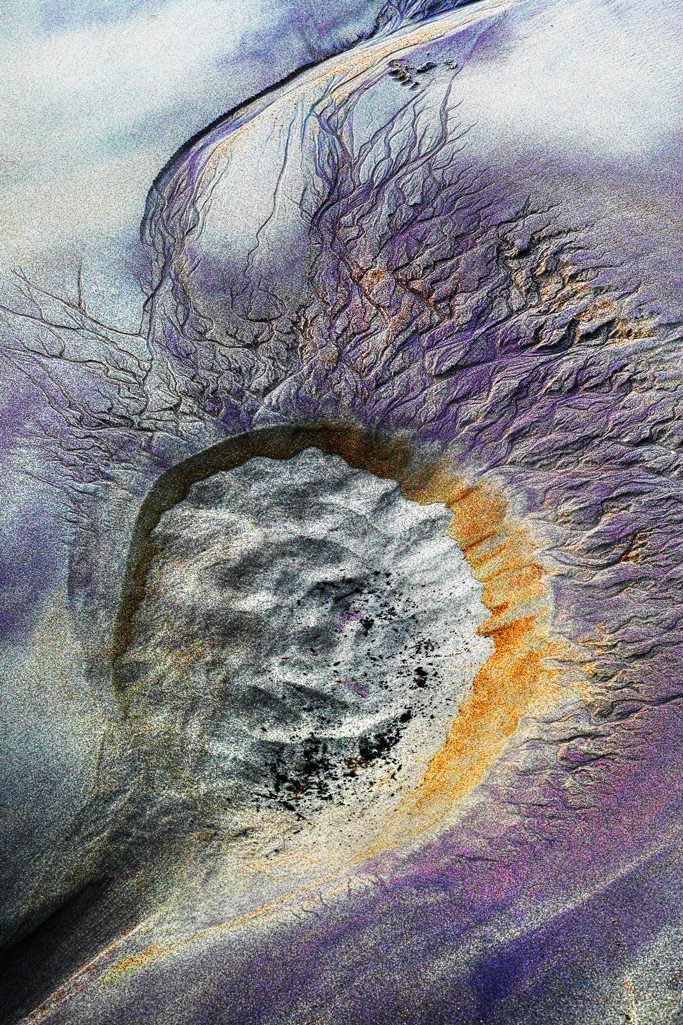
2016 Award Nominations – Spring
This has been a productive spring for nominations! First, my team at Checkerboard, Ltd. received two Louie Award nominations for our work on BRIDES Fine Wedding Papers. The Louie Awards are the “Oscars” of the personalized product industry. I’m fortunate to lead an incredibly talented group of product designers. We received nods this year for these designs:
Tropical Chinoiserie
Fashion Foils
Second, I was personally nominated this year in the International Color Awards, an international visual and digital arts competition, for this image:
Godseye
Featured in an Article on 3Ders.org
3Ders.org, the world’s largest 3D news website, featured a very kind article about me and my Battery Holder Design. Please give it a read! Check it out here: “Stylish & Cool Stackable Battery Holders.”
3D Printing Interview with eMedia Chat
eMediaChat was kind enough to bring me back for a discussion about 3D printing and the future of 3D design. The video feed is less than perfect, so I’d recommend listening to it as a podcast. Since this was a live stream, jump ahead to 4:30 to skip the preshow. Either way, take a listen and leave your thoughts!
eMediaChat 77: Adoniram Sides on 3-D Printing from RELATECASTS on Vimeo.